Making a credit score something you can act on
Replicating a winning model in a tougher market
Founded in 2006, Finder is a global financial comparison platform that helps people make better financial decisions by recommending the right products. After years of refining its model in Australia, Finder launched a free credit score service in 2018 — letting users monitor their score while powering personalised product recommendations based on their real financial situation.
In 2023, Finder set out to replicate that success in the UK. As a relatively new entrant in a highly competitive market, Finder UK needed a scalable way to attract members and stand out from established players. The team set three goals against this:
Project Goals
-
Grow the member base
A free, high-value service would attract sign-ups and convert anonymous visitors into known members.
-
Unlock personalisation
Access to credit data would lay the foundation for tailored product recommendations across the platform.
-
Scale upsales
A trusted dashboard experience would become a new channel to surface relevant financial products and drive revenue.
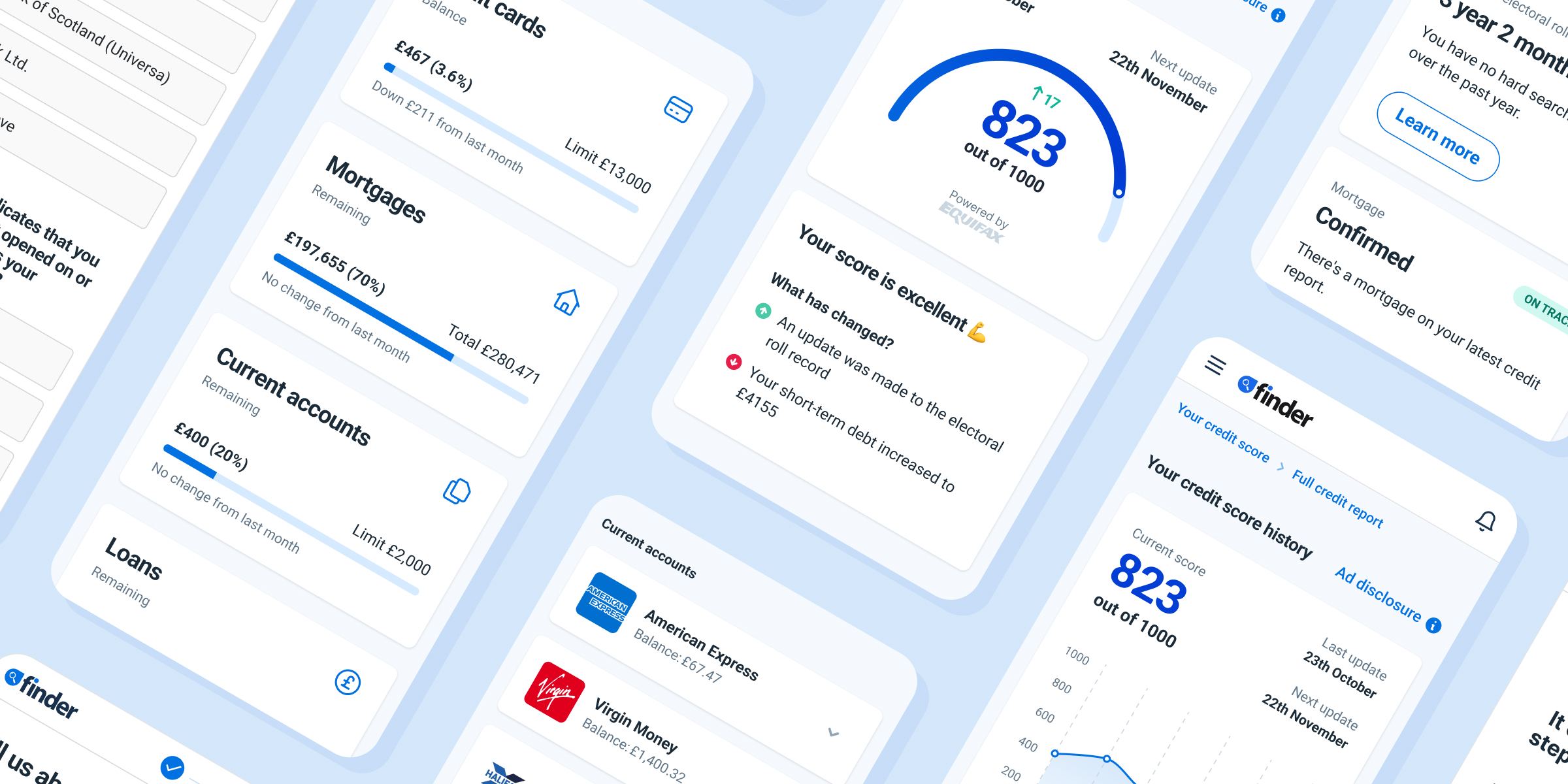
The image below shows the original Australian product — the proven model we set out to replicate for the UK market.
People wanted to improve their score, not just see it
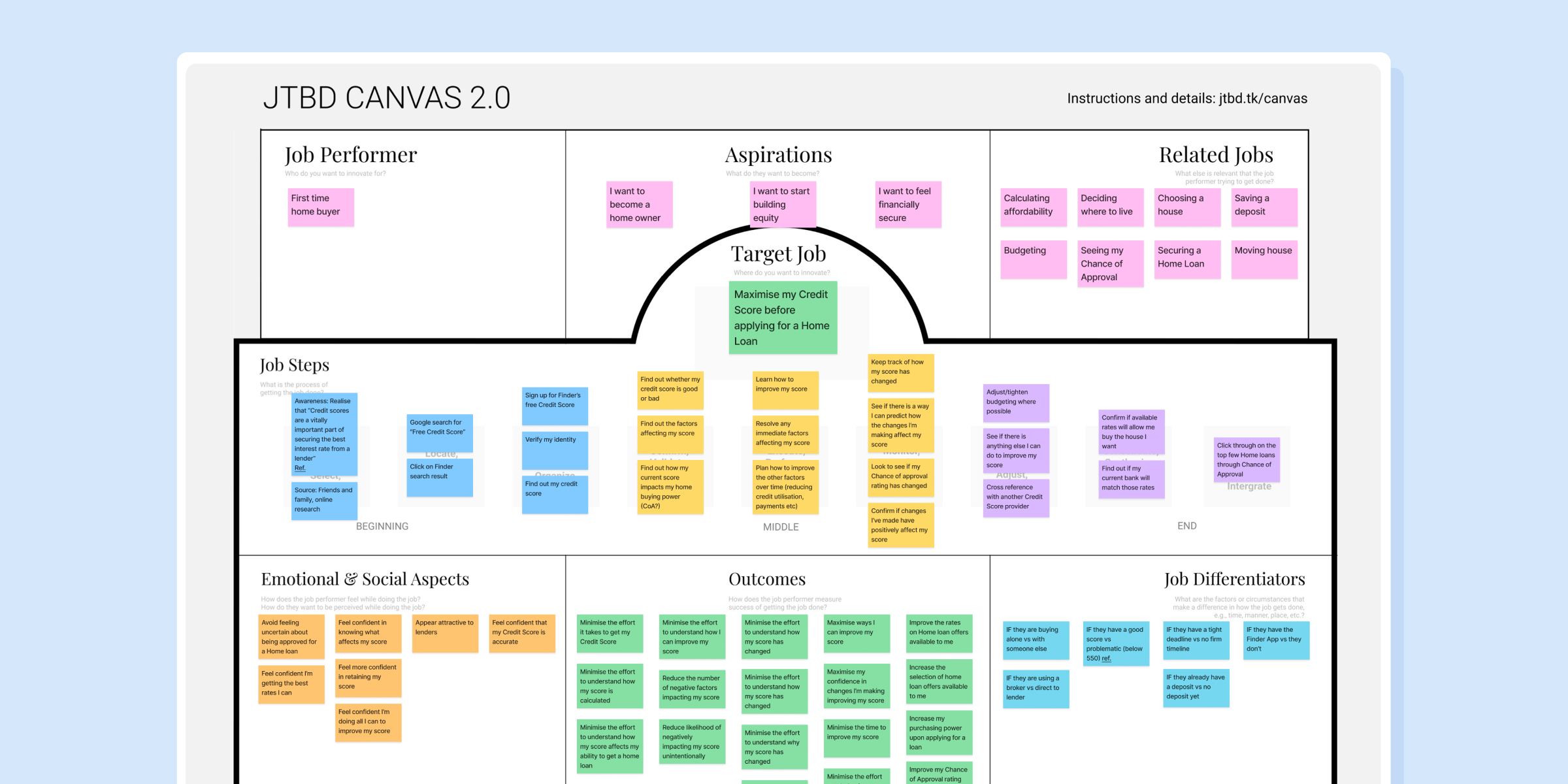
Before committing engineering effort, we needed to ground the MVP in evidence — both what users actually needed and the constraints we'd be designing against.
I drew on four sources. I interviewed 6 people who had recently taken out a home loan, to understand their mindset, needs, and the challenges they faced around their credit score. Studying UK competitors revealed table-stakes features. Analytics from the AU product showed which parts of the experience users engaged with — and which they ignored. Finally, a UX audit of the existing Australian product surfaced structural and visual shortfalls — giving us a clear starting point for what to improve in the UK build.
Key Insights
-
People want to improve their score
The interviews surfaced one consistent need: knowing the number isn't enough — people want to know how to move it, and what's holding it back.
-
Competitors made improvement guidance the standard
Competitor analysis revealed rivals built their strategy around teaching people how to improve their score.
-
Users only engage with what's personal to them
Product analytics showed people skipped past generic comparisons and educational content, engaging only with what was tied to their own situation — making personalisation a core requirement, not a nice-to-have.
-
A score on its own doesn't help users act
The UX audit found the score presented as a bare number — no benchmarks, no bands, no indication of what had changed since the last check — leaving users informed but not able to act. It was also built on Finder's previous design system, long since replaced.

Defining what an actionable score required
With research in hand, I worked closely with the product owner, design lead, marketers, and engineers to translate the findings into a concrete set of product requirements — what the product had to do, before we worked out how.
Product Requirements
-
Personalisation as the main value prop
The whole product rests on one promise: insights and recommendations tied to the user's real credit data — not the generic advice they could get anywhere else.
-
Explain the score, not just show it
The app should show the current score, what changed recently, and why — paired with personalised guidance on how to improve, and a way to see exactly what the score is built on.
-
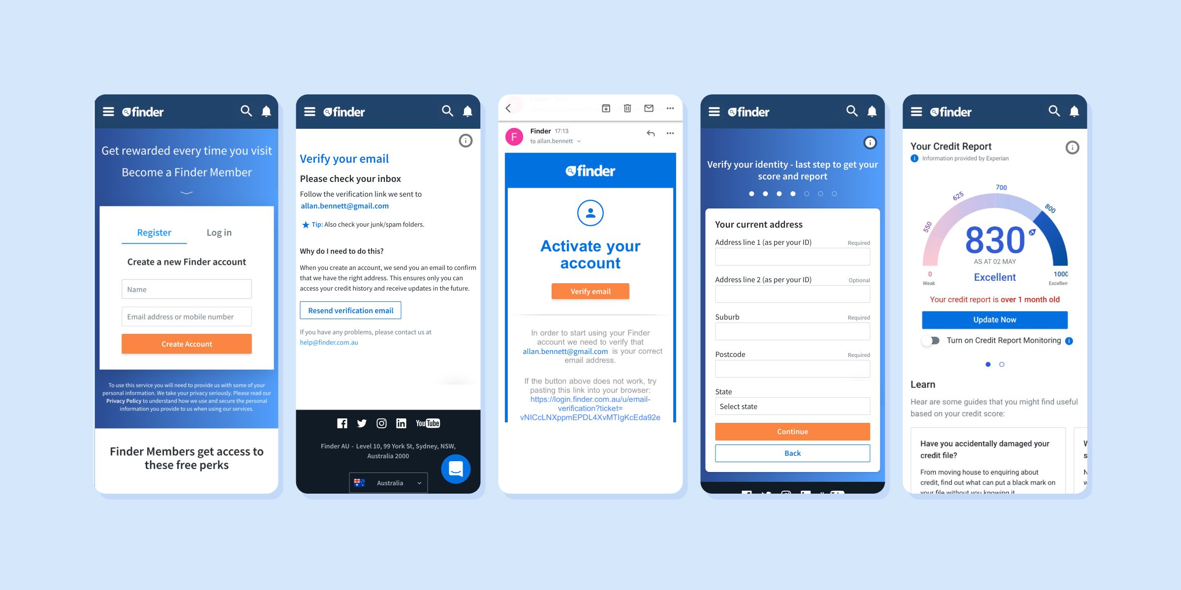
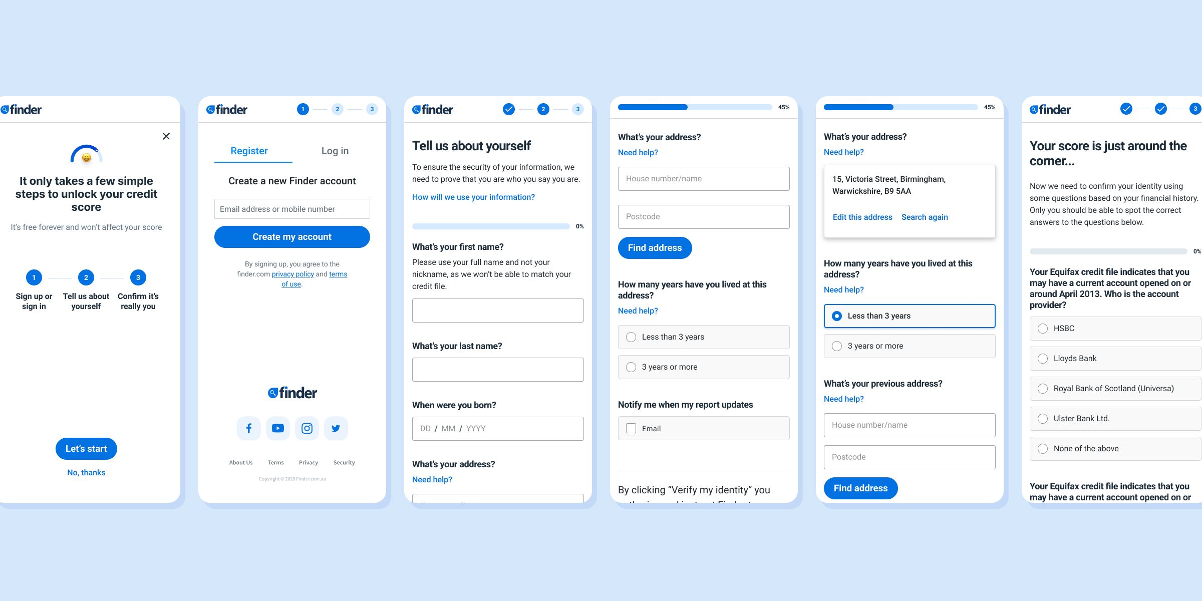
Frictionless onboarding
Sign-up and KYC should feel as effortless as possible — identity verification was the highest-risk drop-off point.
-
Bridge into product comparison
The app should open clear paths into Finder's credit card and loan comparison journeys, with results matched to the user's real credit data — turning the score into a more accurate, lower-effort way to find products that actually fit.
With research synthesised and requirements agreed, I had everything I needed to move into prototyping.
The hard part lived under the interface
We worked iteratively — testing prototypes with users as we built, so we could see what landed and what didn't. Most of the hard problems traced back to the same root: making genuinely complex financial data feel simple — often while working inside constraints we couldn't change.
Challenges
-
KYC questions were the onboarding bottleneck
In early usability testing, the identity-verification step became a clear bottleneck. The questions were long (sometimes over 200 characters), jargon-heavy, and demanded detailed knowledge of the user's own accounts and credit history. We weren't allowed to rewrite the copy — it came verbatim from the API. Our only lever was the surrounding UI: clear hierarchy, breathing room, and a layout that lowered cognitive load so users could focus their energy on parsing the question itself.
-
The credit report was overwhelming
The full report held a huge amount of detail, and users got lost in it. Making it navigable took real work — the clearest win was a sticky table-of-contents that let users see the whole structure at a glance and jump straight to the section they needed.
-
The insights were full of jargon
The insights meant to explain how to improve a score were technically accurate but full of credit-industry terminology users couldn't parse. We rewrote them in plainer language, focused on concrete actions rather than abstract concepts — turning ratios and metrics into specific things users could actually do.
-
Generic ads undermined trust
Early on, we considered mixing non-personalised product placements into the experience to widen what we could promote. Usability testing killed that idea quickly — users immediately spotted recommendations that didn't fit their situation, and it eroded trust in the rest of the app. We dropped the generic placements and committed fully to personalised recs.
-
The Equifax API's complexity was a ball and chain
The most complex API we'd worked with, and it shadowed almost every stage. Its responses were dense and full of edge cases, so every screen had to be reconciled with what the API could return and what it expected back — a constant tax on the pace of design.
A score you can act on
The final solution is a web app that lets people check their credit score, monitor it over time, see what's driving it, and learn how to improve it. Instead of stopping at the number, it turns the score into something actionable, offering personalised guidance and recommendations tied to their real credit data.
-
Score in context, not in isolation
Alongside the current value, users see their band, the recent change, and exactly what drove it — so they understand at a glance not just what their score is, but why.
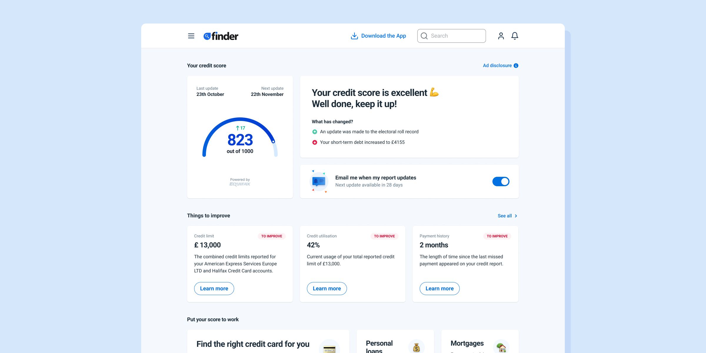
-
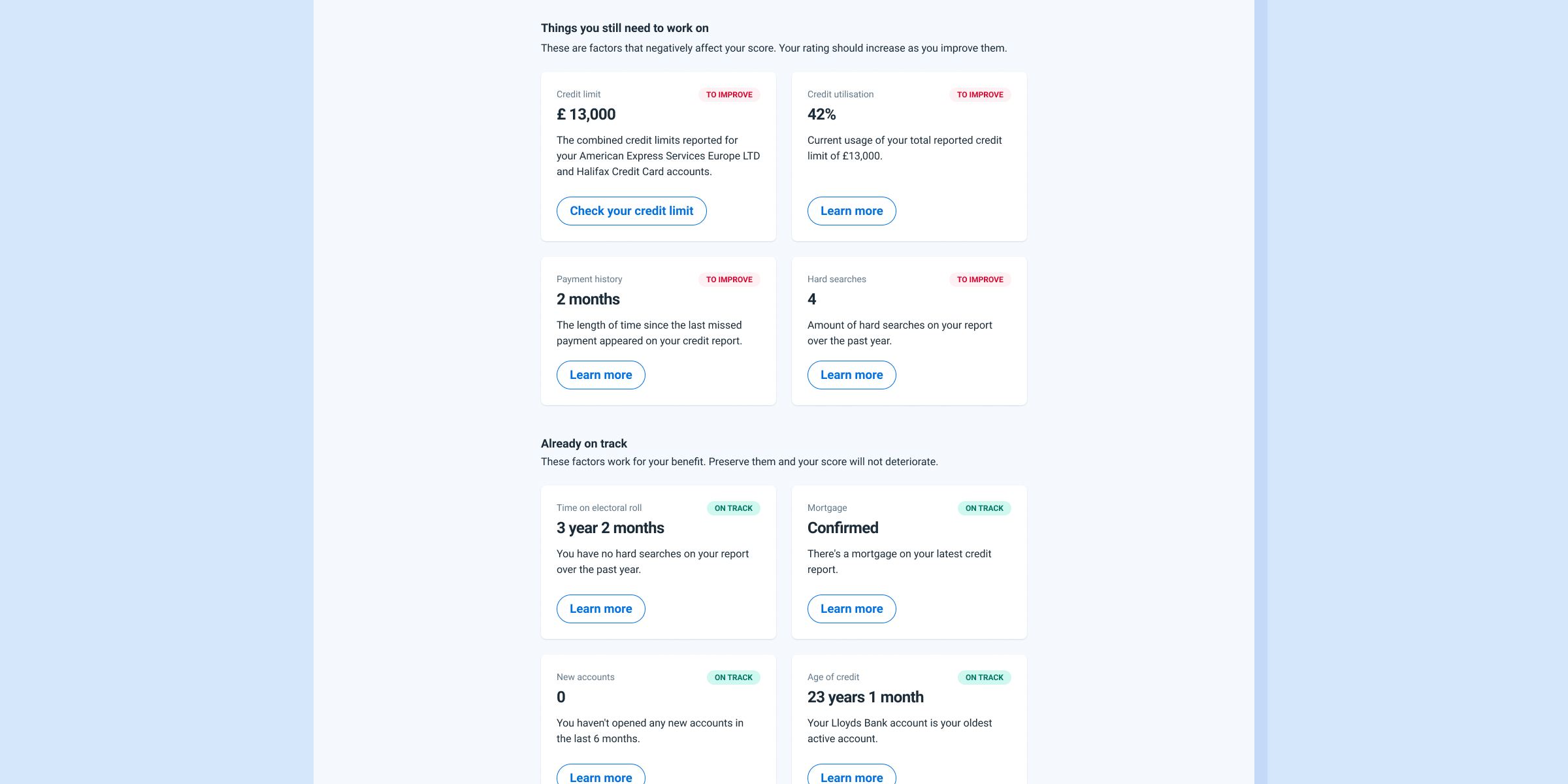
Actionable improvement plan
A dedicated section surfaces a personalised list of actions users can take to improve their score — concrete, prioritised steps rather than generic advice, so users always know what to do next.
-
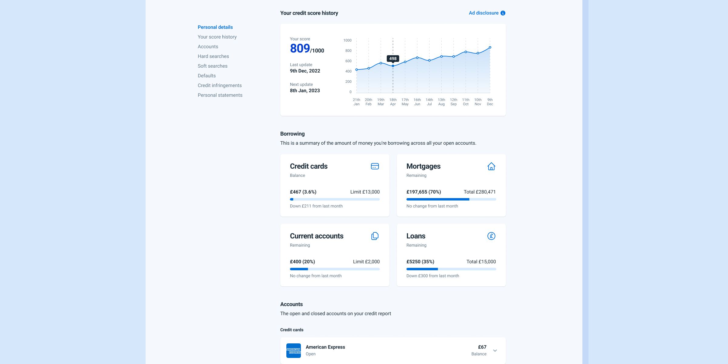
Full credit report
For users who want to go deeper, a comprehensive report breaks down every factor contributing to their score — including score history over time, a summary of current borrowing, and a complete list of accounts. Dense by nature, but made navigable — nothing hidden, nothing hard to find.
-
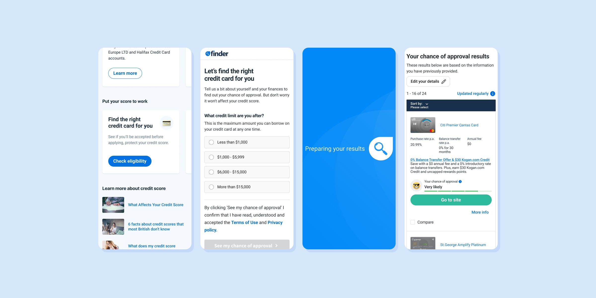
Apply with better odds
Users can jump straight into product comparison flows for credit cards and loans, with recommendations tailored to their actual score. Results are faster, more accurate, and far more likely to end in approval for what they apply for.
-
Onboarding stripped to the essentials
Built on a forms system optimised for accessibility and usability, with every redundant step removed between landing and a verified account. Verification runs on name, address, and a short set of KYC questions — no photographing or scanning identity documents — with the address found through a single lookup rather than typed out. Less friction, fewer of the data errors that block verification, and a more inclusive flow.
-
A landing page built to convert
The product's front door and main acquisition surface — built to turn anonymous visitors into signed-up members. A deliberately minimal page that leads with one message: check your score for free, understand it, and find products that fit your situation.
The growth engine it became
From launch, the app attracted users immediately and quickly became Finder UK's primary channel for acquiring new members.
Results
-
1,500 users in month one
A strong start for a brand-new service in a market where Finder had limited brand recognition — validating the bet that a free credit score could cut through the noise.
-
50K users annually
Within a year the app was acquiring members at scale — delivering on the core business goal and laying the foundation for personalised product recommendations across the platform.
-
Average credit score improved from 479 to 738
Users who engaged with the app regularly saw their score move from Fair to Very Good over time — evidence that the insights and guidance were landing.
-
14% uplift in product application conversion
By connecting the credit score app to Finder's existing comparison flows, users no longer had to manually enter financial details to get personalised offers. The data was already there — which meant fewer steps, better-matched recommendations, and a meaningful lift in conversion on journeys that existed long before the app.