Redesigning Miuki — an e-commerce for an almost infinite catalogue
A shop working against the brand it sold
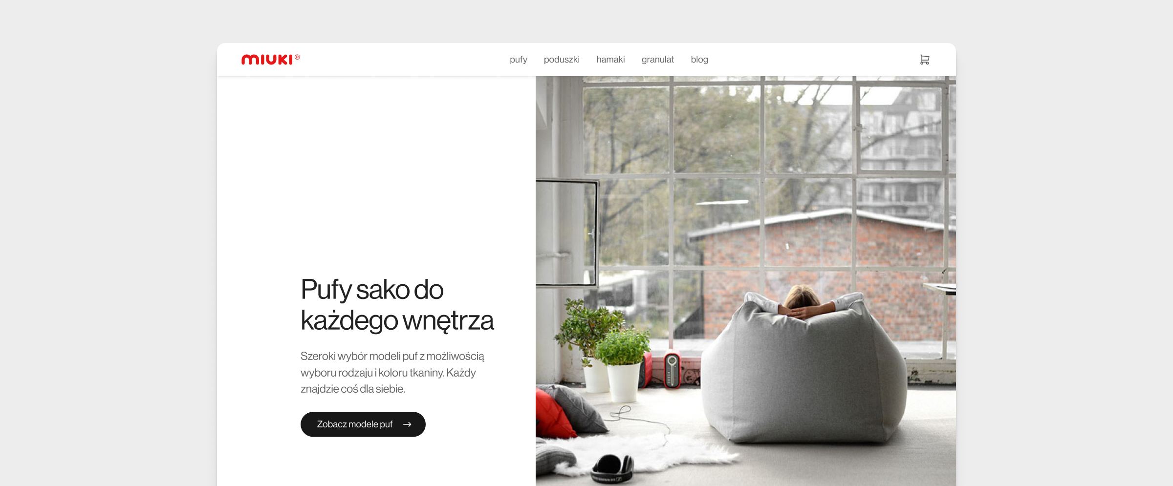
Miuki is a Polish furniture brand best known for its made-to-order poufs, with a smaller line of pillows and hammocks. Each piece has the detail and finish you'd expect from a small studio, not a high-street brand.
The owners care deeply about design and have strong opinions about how their brand should be expressed — but the existing shop didn't reflect any of that. It was outdated, hard to navigate, and made the products look cheaper than they were. They came to me to redesign the experience from the ground up — visually, structurally, and functionally.
Project Goals
-
Lift sales
The shop was underperforming commercially. The goal was to find the friction points costing the owners sales and fix them.
-
Match the shop to the brand
The brand already had a strong visual identity — the shop just wasn't expressing it. The old site looked like a generic template; the new one had to feel like an extension of the showroom.
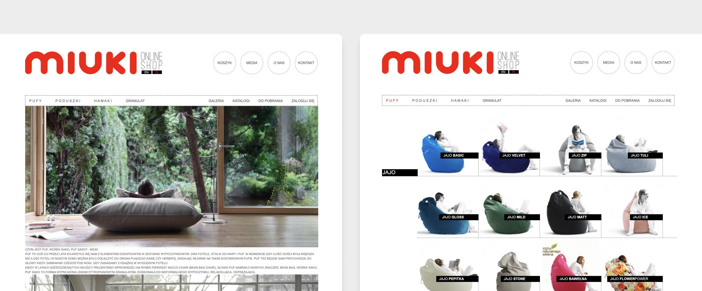
Here's what we started with — the old shop that made the products look cheaper than they were.
Mapping an almost infinite catalogue
We started with a series of workshops with the owners. Because every product is made to order, the catalogue isn't a fixed list — it's a combinatorial space of models × materials × colours. Before I could design anything, I had to understand that space, the brand behind it, and the production process that shaped what was possible.
Alongside the workshops, I ran customer conversations to understand how people actually shop for a custom pouf — what they cared about, in what order, and where they got stuck. I audited the existing shop end-to-end, ran a session with Miuki's SEO agency so the information architecture would support search from day one, and reviewed recent Baymard Institute findings to ground the standard parts of the experience in what works.
Key Insights
-
The offer was a system, not a list
Several pouf models, each available in tens of materials, each material in many colours.
-
Every customer had a different first criterion
For some it was colour (matching a room they already had), for others the model (a specific shape they'd seen), for others the material (texture, feel, durability). There was no single dominant path — and forcing one would alienate the rest.
-
Material names meant nothing to newcomers
Names like "stone" and "moon" didn't tell a visitor how a fabric actually looked, felt, or behaved. Customers were trying to describe what they wanted in everyday language — "soft", "rough", "easy to clean".
-
Long-tail search drove real traffic
A meaningful share of visits came through long-tail product queries, so the IA needed clean, stable URLs per model and per material, with proper category pages — not filter combinations behind a single product list.
-
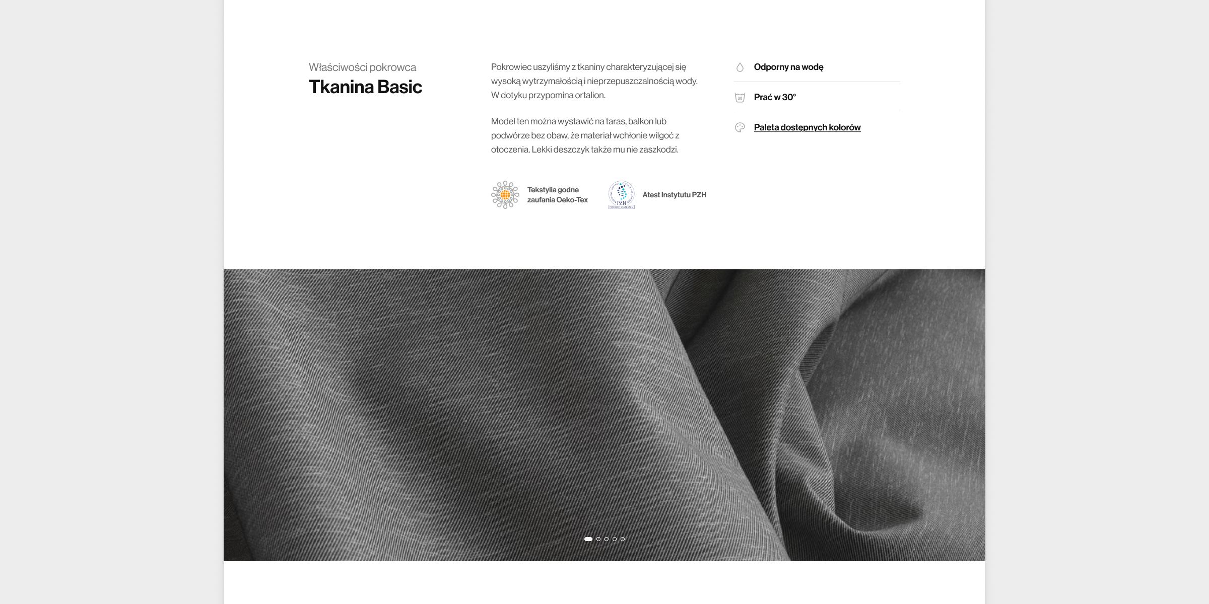
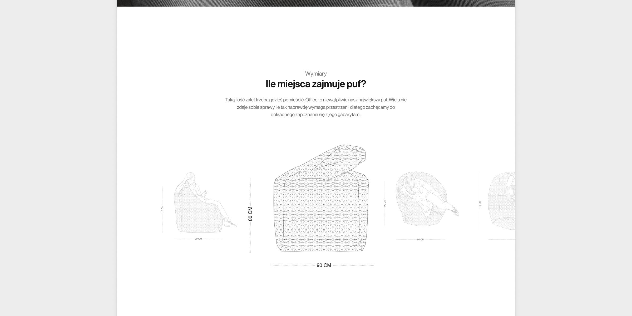
The product page has to replace a showroom
For made-to-order products with no returns, multiple photos, scale references, close-ups, and exhaustive descriptions consistently reduce hesitation on high-consideration purchases.
-
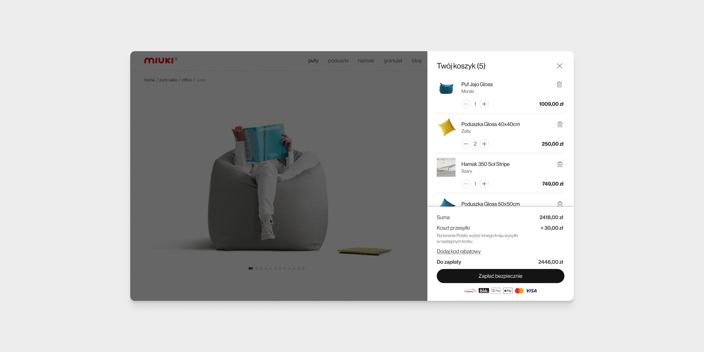
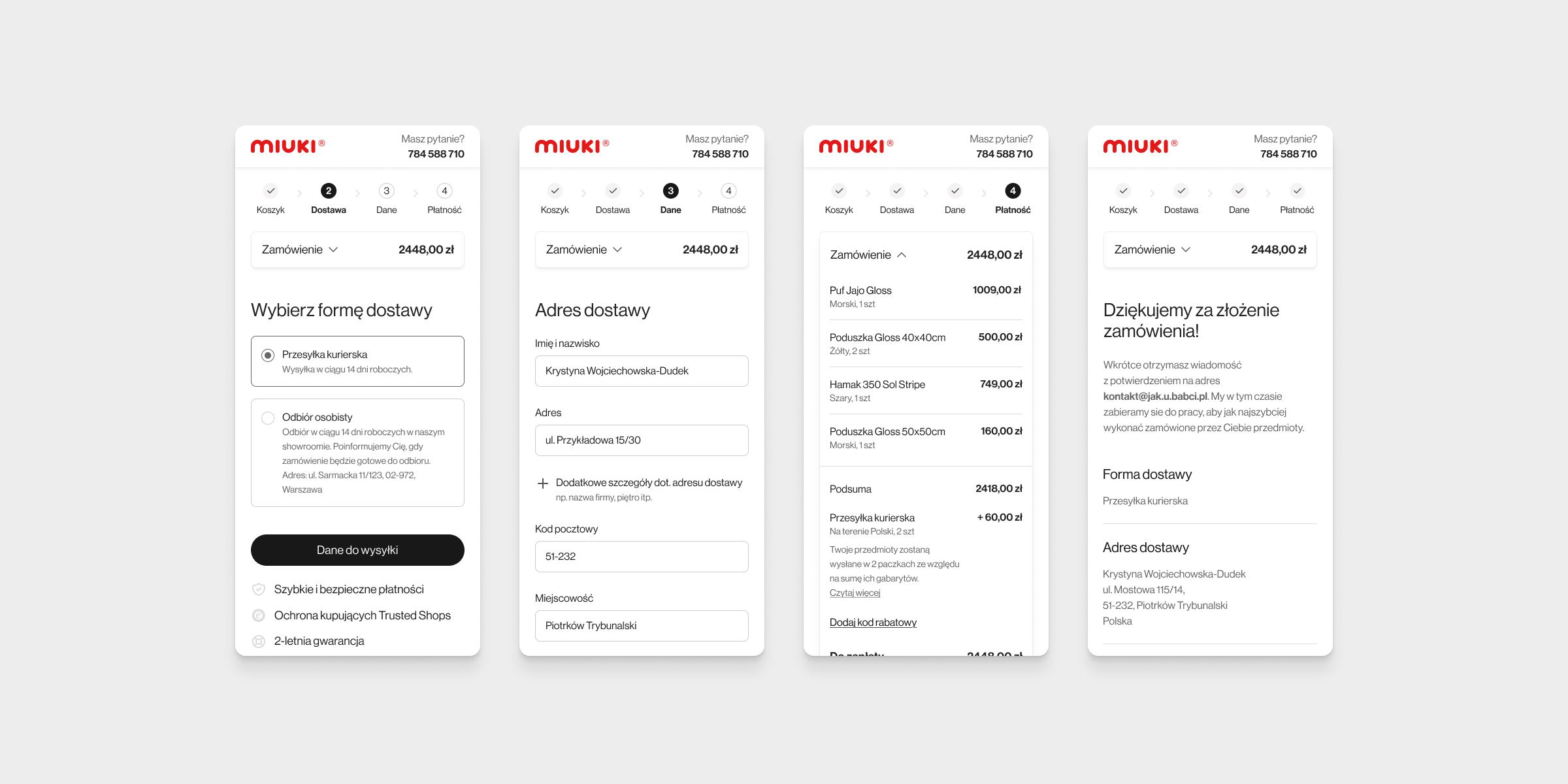
The checkout was bloated
It was overly long, padded with redundant fields and steps that added no value — every extra ask another place to lose someone at the exact moment they were ready to buy.
Letting every shopper start where they want
The core tension was clear: an almost infinite catalogue, sold to customers who each cared about a different axis of it first. The IA couldn't pick a winner — it had to let every type of shopper start from the criterion that mattered most to them and arrive at the same products from any direction.
On top of that, because every piece is custom-made and non-returnable, the product page had to stand in for the showroom — communicating shape, size, texture, and colour accurately enough that customers were confident before they paid.
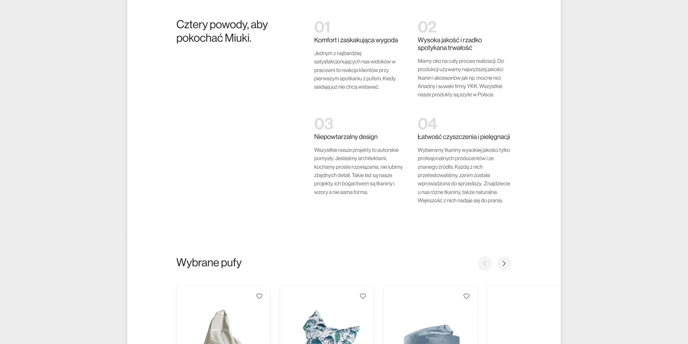
Product Requirements
-
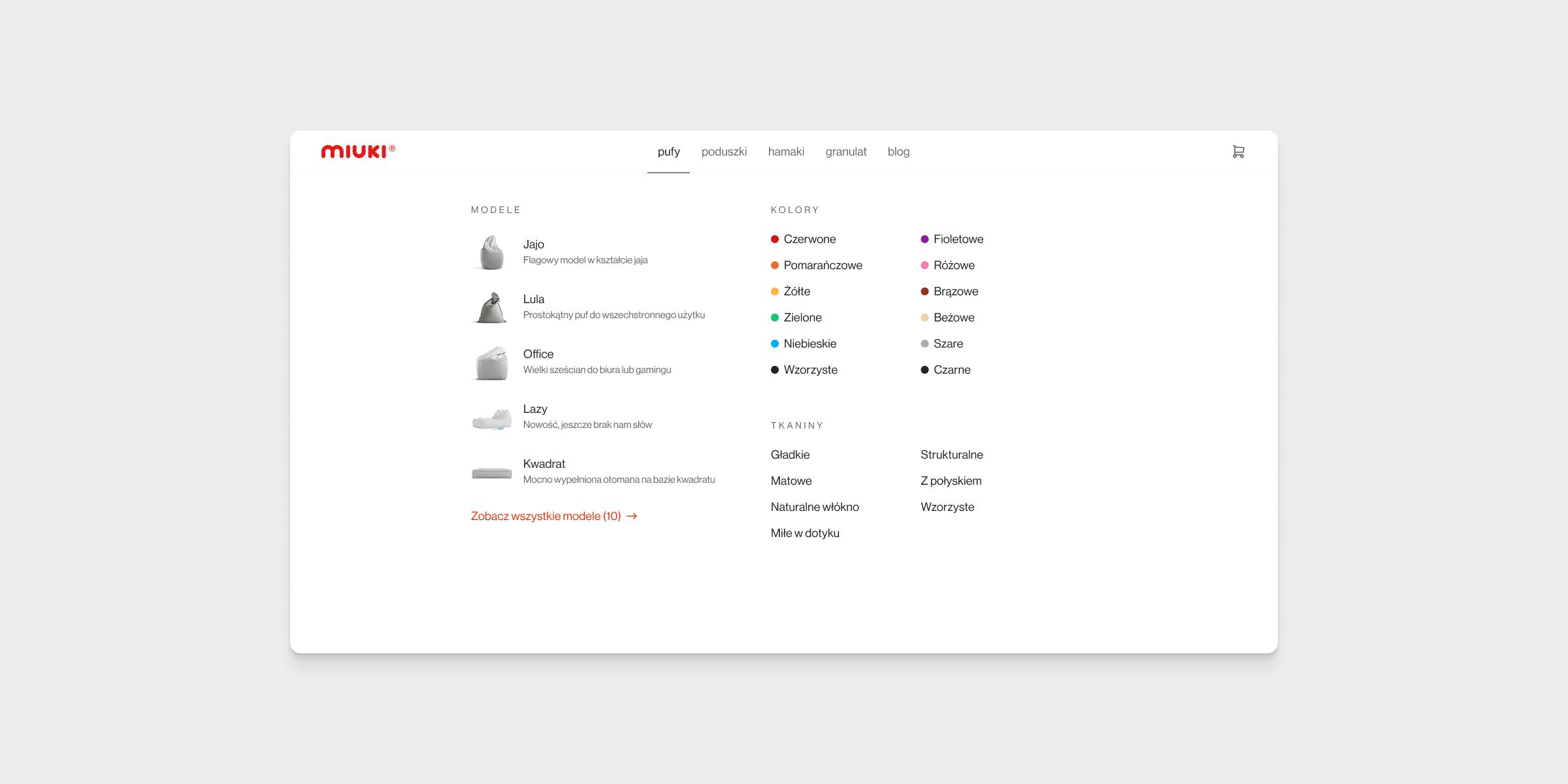
Multi-entry navigation
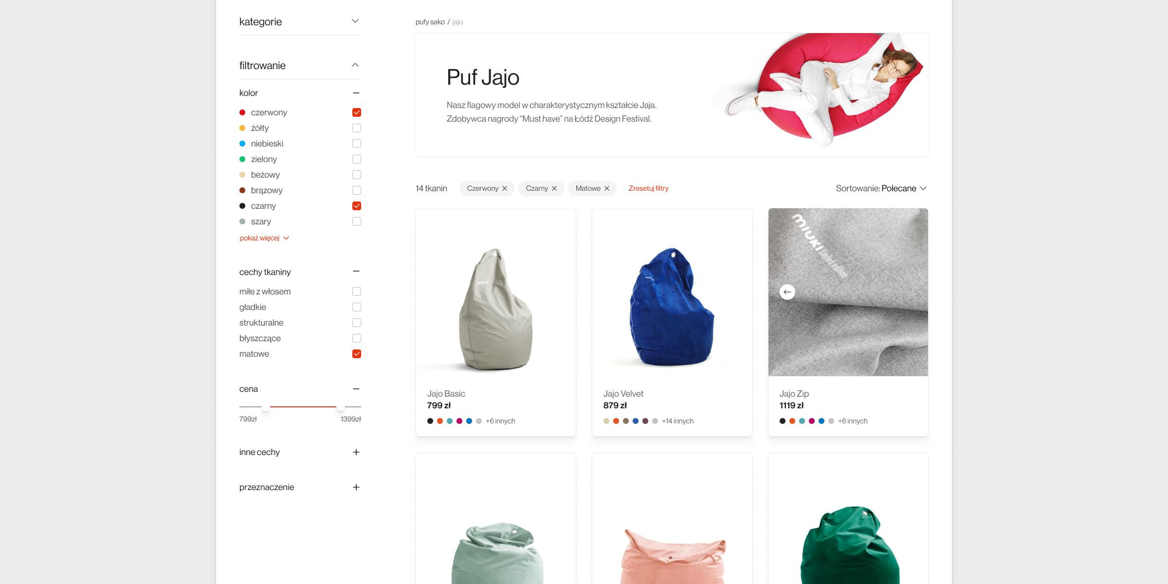
Customers had to start from whichever criterion mattered most — model, material, or colour — each a real, browsable section, not a hidden filter state. Whichever entry they picked, the listing filters had to be fully composable, so they could layer the other axes on top without losing context.
-
A visual-first catalogue
With genuinely original pouf shapes, words alone weren't enough. Every place a model appeared had to lead with a photo, so customers always recognised what they were looking at.
-
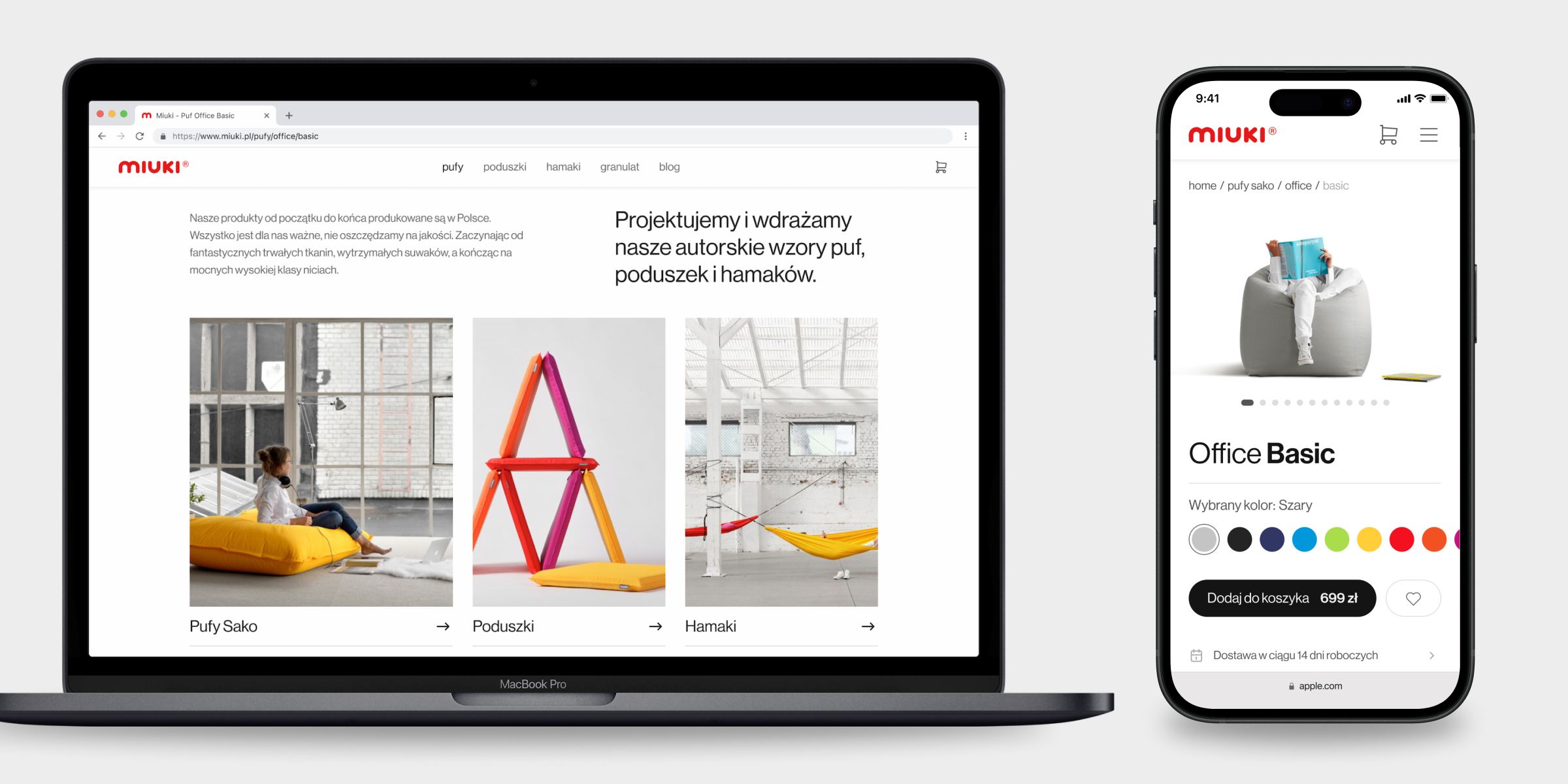
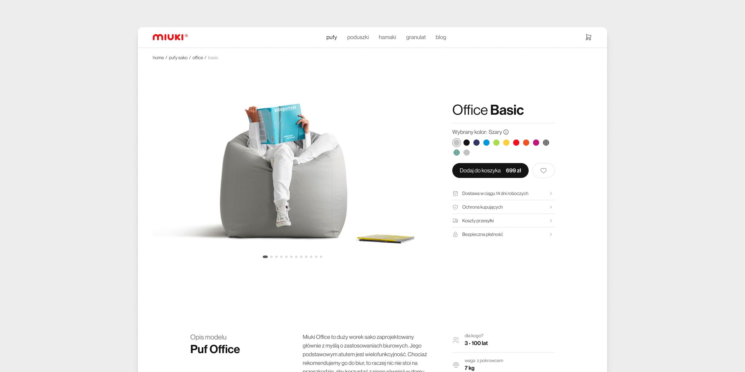
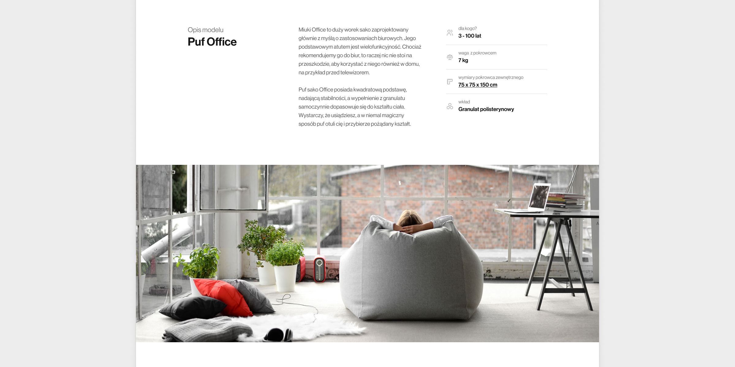
Showroom-grade product pages
Made-to-order means non-returnable, so the product page had to do a showroom's job: in-context photos, a person for scale, macro close-ups of the material, technical drawings for dimensions, and copy long enough to describe how the material actually feels and behaves.
-
Plain-language material discovery
Brand-named materials like "stone" and "moon" had to stay — they're part of the identity — but customers needed to find them without knowing the vocabulary, through everyday descriptors of texture, feel, and behaviour.
-
A stripped-down checkout
Ask only for what a made-to-order purchase needs — no redundant fields, no extra steps — with a clear running summary of the custom configuration, so the final click felt safe.
With the structure and requirements set, the redesign could begin.
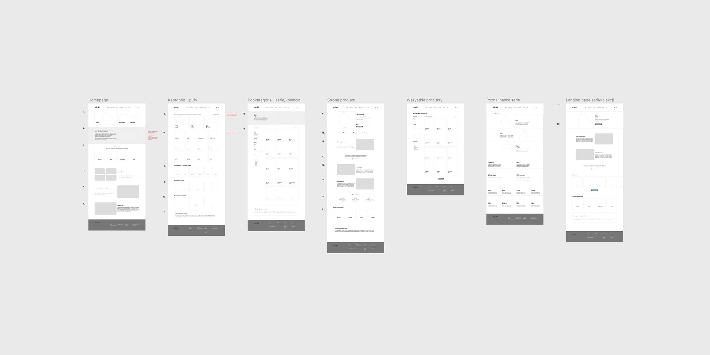
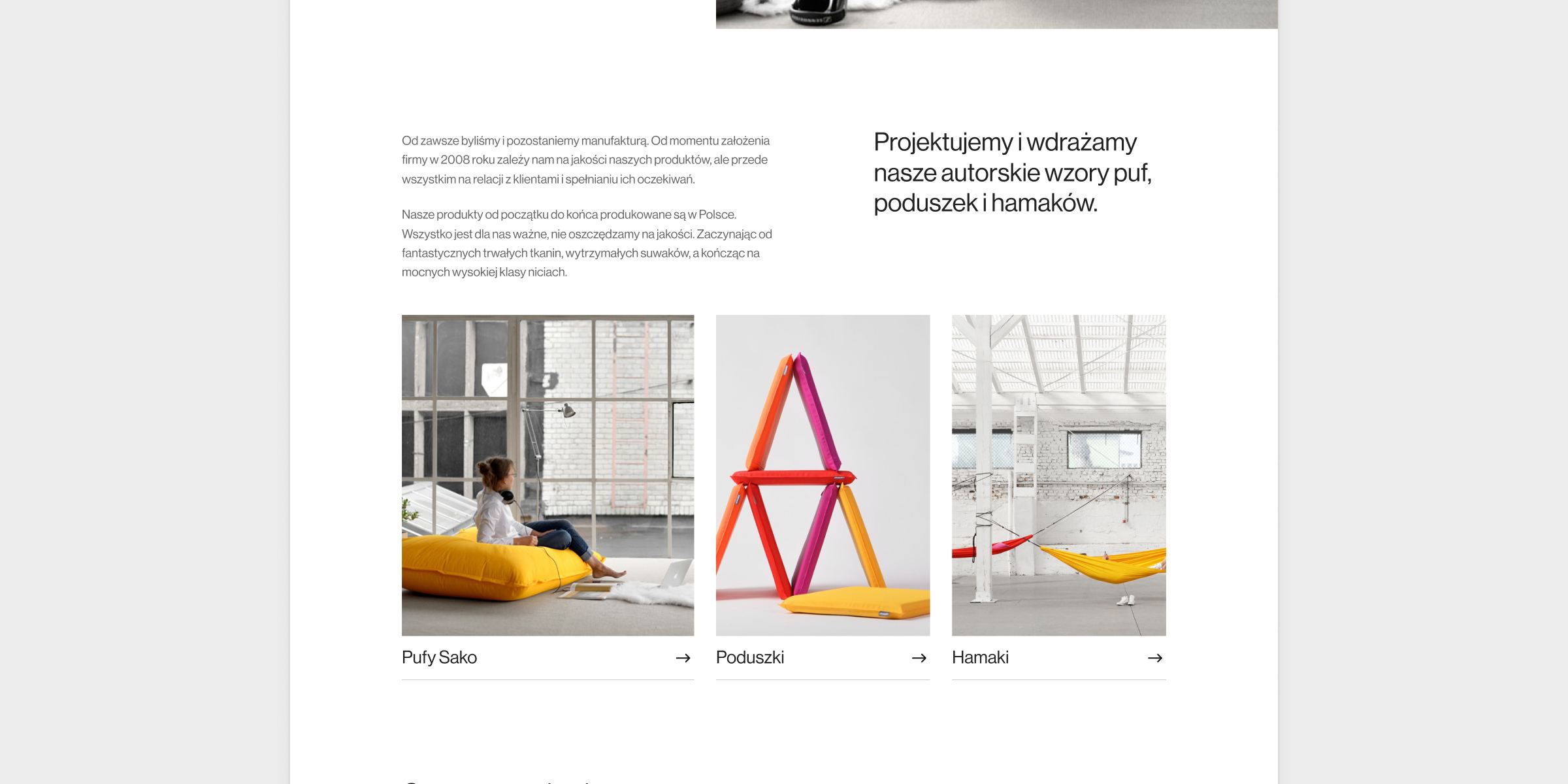
A ground-up redesign
A full ground-up redesign of the Miuki shop — new information architecture, navigation, product pages, and checkout, plus a modernised look that finally brings the shop in line with the brand.
-
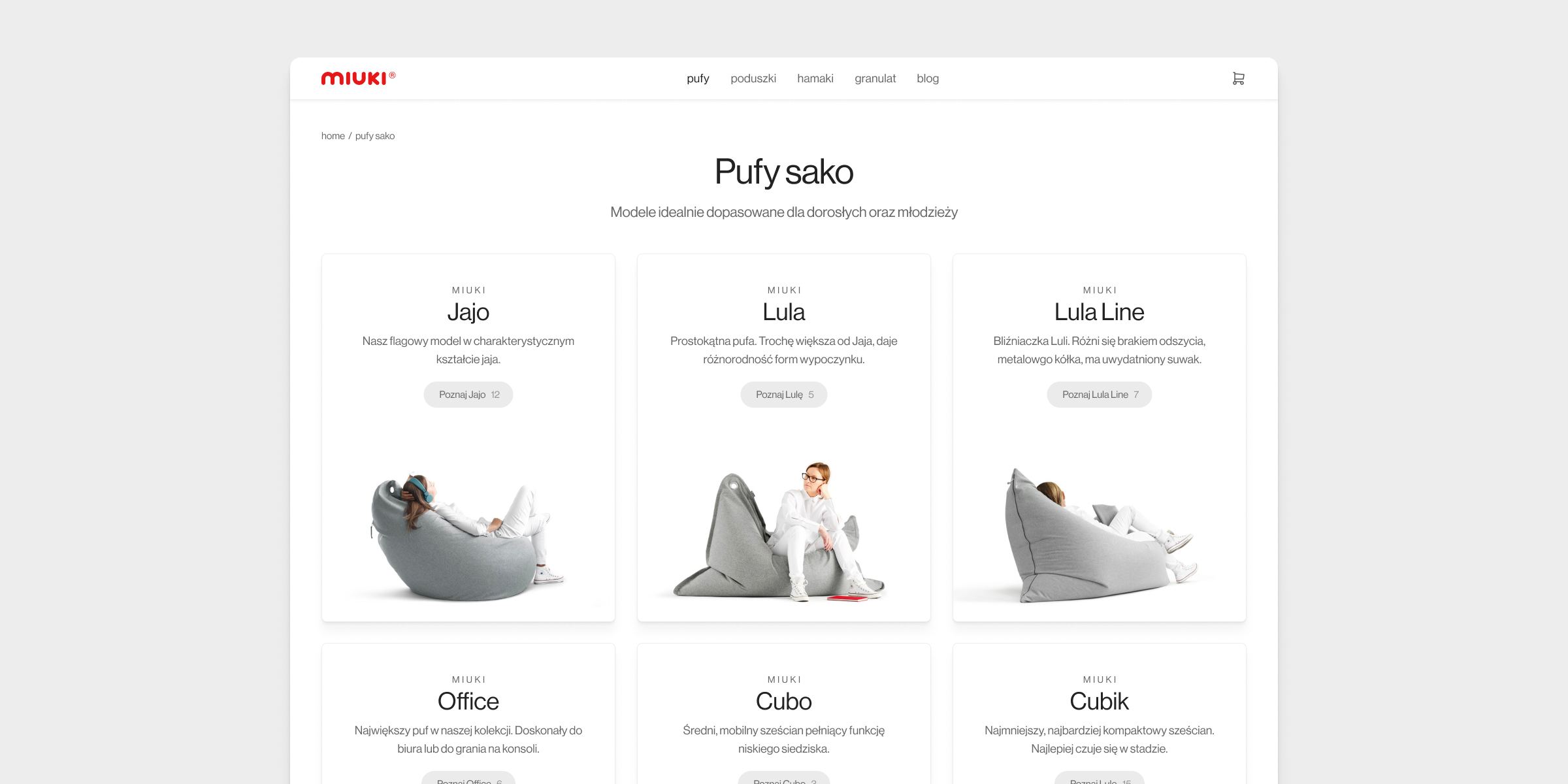
Information architecture & navigation
A flexible structure that lets every shopper start from the axis they care about most. Model, material, and colour each became a real, indexable section with its own landing page; whichever entry a customer picks, composable filters let them layer the other axes on top. And because shapes are original and material names abstract, every nav entry, tile, and filter chip carries a photo.
-
Material discovery
A layer over the brand vocabulary that lets people find what they want with the words they actually use. Filters for texture, feel, and behaviour sit alongside the brand-named materials, and each material gets its own page with macro photography and a written description of how it looks, feels, and behaves — turning an abstract name into something concrete.
-
Showroom-grade product pages
The single most important page on the site, designed to replace a showroom for a customer who can't return what they buy: in-room shots with a person for scale, macro close-ups of the fabric, the owners' own dimensioned technical drawings, and longer-than-usual descriptions of how the material feels and behaves over time.
-
A stripped-down checkout
Cut to the essentials — minimum steps, minimum fields — with a clear running summary of the custom configuration the customer is buying, so the final click feels safe.
A shop that finally sells the brand
The redesigned shop launched and quickly outperformed the old one across the funnel.
Results
-
21% uplift in sales
The combined effect of clearer navigation, stronger product pages, and a streamlined checkout — measured against the equivalent period before launch.